Responsive Sliding Signup and Login Form Using HTML, CSS, and JavaScript
By Bytewebster - February 11, 2023
Welcome to this tutorial on creating a responsive sliding signup and login form using HTML, CSS, and JavaScript. In today's digital world, it is essential to have user-friendly and visually appealing forms for your website. This tutorial will guide you through the process of building a dynamic and interactive form that is both aesthetically pleasing and functional. Let's get started!
Working
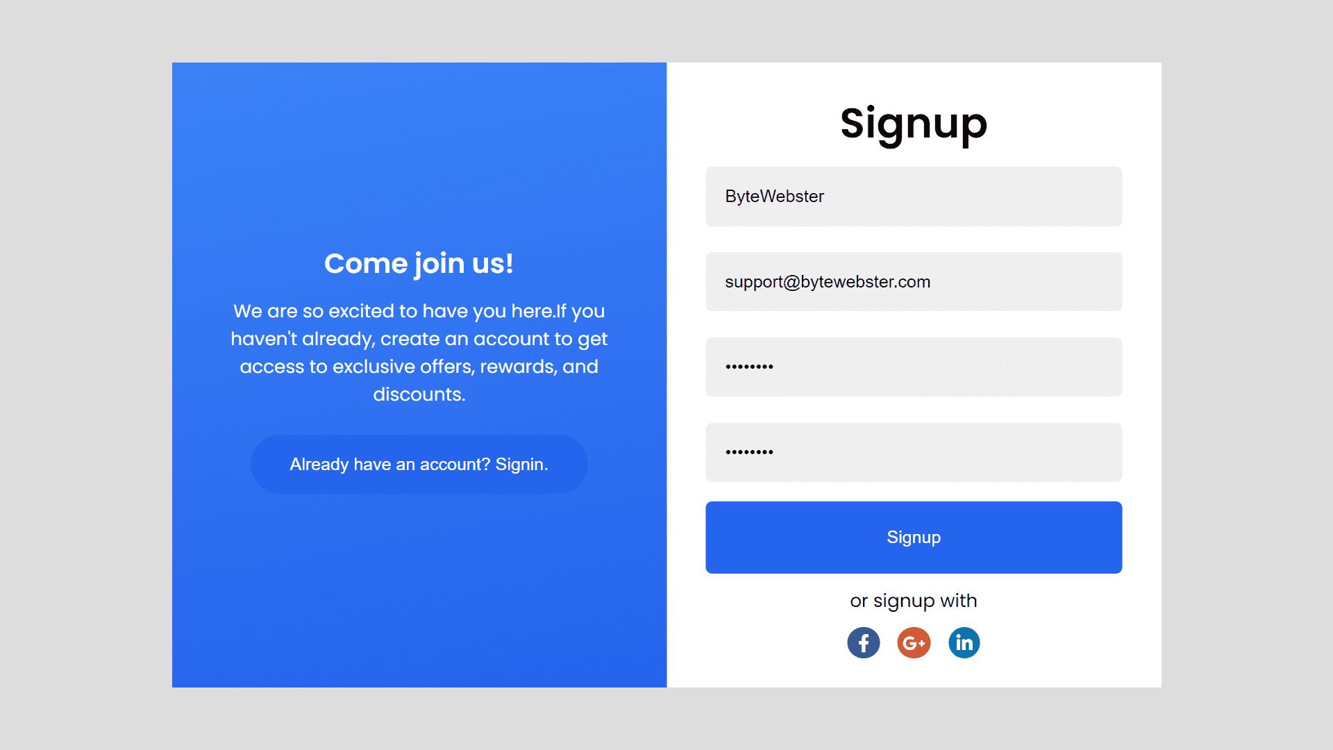
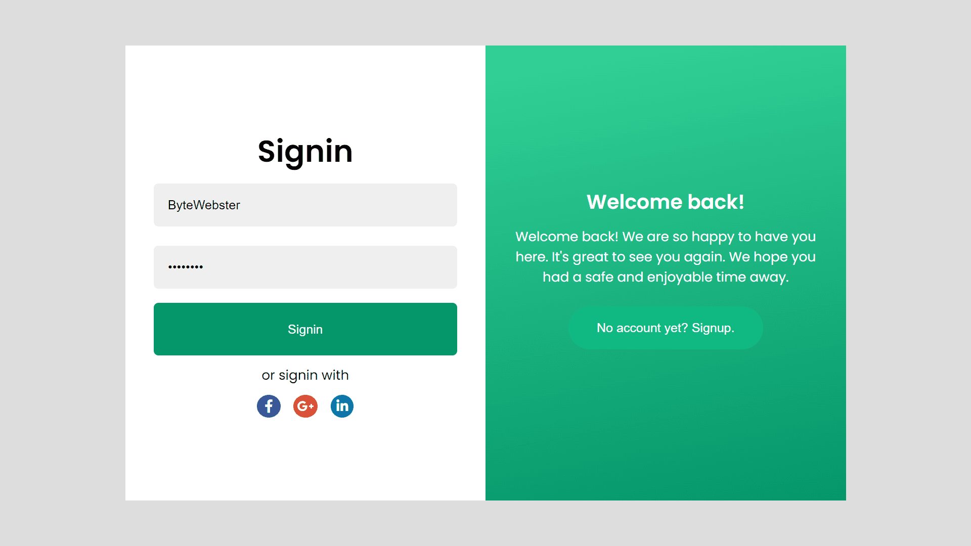
A sliding signup and login form allows users to either sign up for an account or log into an existing one, all within a single form that slides back and forth to reveal either the signup or login section. This type of form is usually implemented using HTML, CSS, and JavaScript.
Detailed Overview of Project
The Responsive Sliding Signup and Login Form is a web design project that creates a user-friendly interface for users to sign up or log into a website. It is built using HTML, CSS, and JavaScript.
The sliding feature allows users to switch between the signup and login forms, making the process more efficient and visually appealing.
HTML Structure
The HTML code of this sliding signup and login form is to create a visually appealing and functional form for users to enter their information. The code is separated into different sections including the "container," "forms-container," "form-control signup-form," and "form-control signin-form."
The "container" class holds all of the content for the signup and login form. The "forms-container" class holds both the signup form and the signin form. The "form-control signup-form" class creates the structure for the signup form.
including the inputs for the user to enter their username, email, password, and confirm password. The signup form also includes a button for the user to submit their information and social media icons for alternative signup options.
The "form-control signin-form" class creates the structure for the signin form, including inputs for the user to enter their username and password, as well as a signin button and social media icons for alternative signin options.
The "intros-container" class holds two other classes, "signin-intro" and "signup-intro," which are the introductions for the login and signup forms respectively. These introductions include a header and a message welcoming the user to the form and offering them information about the benefits of creating an account. Both introductions also include buttons to switch between the signup and login forms.
<div class="container">
  <div class="forms-container">
    <div class="form-control signup-form">
      <form action="#">
        <h2>Signup</h2>
        <input type="text" placeholder="Username" required />
        <input type="email" placeholder="Email" required />
        <input type="password" placeholder="Password" required />
        <input type="password" placeholder="Confirm password" required />
        <button>Signup</button>
      </form>
      <span>or signup with</span>
      <div class="socials">
        <i class="fab fa-facebook-f"></i>
        <i class="fab fa-google-plus-g"></i>
        <i class="fab fa-linkedin-in"></i>
      </div>
    </div>
    <div class="form-control signin-form">
      <form action="#">
        <h2>Signin</h2>
        <input type="text" placeholder="Username" required />
        <input type="password" placeholder="Password" required />
        <button>Signin</button>
      </form>
      <span>or signin with</span>
      <div class="socials">
        <i class="fab fa-facebook-f"></i>
        <i class="fab fa-google-plus-g"></i>
        <i class="fab fa-linkedin-in"></i>
      </div>
    </div>
  </div>
  <div class="intros-container">
    <div class="intro-control signin-intro">
      <div class="intro-control__inner">
        <h2>Welcome back!</h2>
        <p>
          Welcome back! We are so happy to have you here. It's great to see you again. We hope you had a safe and enjoyable time away.
        </p>
        <button id="signup-btn">No account yet? Signup.</button>
      </div>
    </div>
    <div class="intro-control signup-intro">
      <div class="intro-control__inner">
        <h2>Come join us!</h2>
        <p>
          We are so excited to have you here.If you haven't already, create an account to get access to exclusive offers, rewards, and discounts.
        </p>
        <button id="signin-btn">Already have an account? Signin.</button>
      </div>
    </div>
  </div>
</div>
Styling With CSS
Now it is time to style these forms which we will do with the help of CSS. and No frameworks of any kind have been used to create these sliding signup and login form.
This responsive sliding signup and login form CSS code sets the style for a sign-in and sign-up page. The main container has a white background, with a width of 760 pixels and a maximum width of 100% of the viewport width. The height of the container is set to 480 pixels, and its position is set to relative. The overflow-x property is set to hidden, meaning that any content that overflows the container horizontally will not be displayed.
The code also sets the styles for the form containers and the intro containers, which are located on either side of the main container. The forms container takes up 50% of the width of the main container, and its text is aligned to the center. The form controls within the forms container are positioned absolutely, with a width of 100% and a height of 480 pixels.
The form control class is set to display in a column and have its contents centered. The form control class has styles for the form headers, inputs, buttons, social buttons, and error messages.
The intro container is also set to take up 50% of the main container's width and has its text aligned to the center. The intro controls within the intro container have styles for the header, paragraphs, and buttons, with a gradient background color.
The code also sets styles for when the form switches between sign-in and sign-up modes. In this case, the styles for the form control and intro control classes change based on the sign-in and sign-up modes, with changes in opacity, z-index, and transforms to switch between the two forms.
@import url("https://fonts.googleapis.com/css2?family=Poppins:wght@300;400;500;600&display=swap");
@import url("https://cdnjs.cloudflare.com/ajax/libs/font-awesome/5.15.2/css/all.min.css");
* {
  margin: 0px;
  padding: 0px;
  box-sizing: border-box;
}

body {
  font-family: "Poppins", sans-serif;
  display: flex;
  justify-content: center;
  align-items: center;
  height: 100vh;
  background-color: #ddd;
  font-size: 14px;
}

.container {
  background-color: #fff;
  width: 760px;
  max-width: 100vw;
  height: 480px;
  position: relative;
  overflow-x: hidden;
}
.container .forms-container {
  position: relative;
  width: 50%;
  text-align: center;
}
.container .forms-container .form-control {
  position: absolute;
  width: 100%;
  display: flex;
  justify-content: center;
  flex-direction: column;
  height: 480px;
  transition: all 0.5s ease-in;
}
.container .forms-container .form-control h2 {
  font-size: 2rem;
}
.container .forms-container .form-control form {
  display: flex;
  flex-direction: column;
  margin: 0px 30px;
}
.container .forms-container .form-control form input {
  margin: 10px 0px;
  border: none;
  padding: 15px;
  background-color: #efefef;
  border-radius: 5px;
}
.container .forms-container .form-control form button {
  border: none;
  padding: 20px;
  margin-top: 5px;
  background-color: #059669;
  border-radius: 5px;
  color: #fff;
  cursor: pointer;
}
.container .forms-container .form-control form button:focus {
  outline: none;
}
.container .forms-container .form-control span {
  margin: 10px 0px;
}
.container .forms-container .form-control .socials i {
  margin: 0 5px;
  color: #fff;
  border-radius: 50%;
}
.container .forms-container .form-control .socials .fa-facebook-f {
  padding: 5px 8px;
  background-color: #3b5998;
}
.container .forms-container .form-control .socials .fa-google-plus-g {
  padding: 5px 4px;
  background-color: #db4a39;
}
.container .forms-container .form-control .socials .fa-linkedin-in {
  padding: 5px 6px;
  background-color: #0e76a8;
}
.container .forms-container .form-control.signup-form {
  opacity: 0;
  z-index: 1;
  left: 200%;
}
.container .forms-container .form-control.signin-form {
  opacity: 1;
  z-index: 2;
  left: 0%;
}
.container .intros-container {
  position: relative;
  left: 50%;
  width: 50%;
  text-align: center;
}
.container .intros-container .intro-control {
  position: absolute;
  width: 100%;
  display: flex;
  justify-content: center;
  flex-direction: column;
  height: 480px;
  color: #fff;
  background: linear-gradient(170deg, #34d399, #059669);
  transition: all 0.5s ease-in;
}
.container .intros-container .intro-control .intro-control__inner {
  margin: 0px 30px;
}
.container .intros-container .intro-control button {
  border: none;
  padding: 15px 30px;
  background-color: #10b981;
  border-radius: 50px;
  color: #fff;
  margin: 10px 0px;
  cursor: pointer;
}
.container .intros-container .intro-control button:focus, .container .intros-container .intro-control button:hover {
  outline: none;
  background-color: #059669;
}
.container .intros-container .intro-control h3,
.container .intros-container .intro-control p {
  margin: 10px 0px;
}
.container .intros-container .intro-control.signin-intro {
  opacity: 1;
  z-index: 2;
}
.container .intros-container .intro-control.signup-intro {
  opacity: 0;
  z-index: 1;
}

.change .forms-container .form-control.signup-form {
  opacity: 1;
  z-index: 2;
  transform: translateX(-100%);
}
.change .forms-container .form-control.signup-form button {
  background-color: #2563eb !important;
}
.change .forms-container .form-control.signin-form {
  opacity: 0;
  z-index: 1;
  transform: translateX(-100%);
}
.change .intros-container .intro-control {
  transform: translateX(-100%);
  background: linear-gradient(170deg, #3b82f6, #2563eb);
}
.change .intros-container .intro-control #signin-btn {
  background-color: #2563eb;
}
.change .intros-container .intro-control.signin-intro {
  opacity: 0;
  z-index: 1;
}
.change .intros-container .intro-control.signup-intro {
  opacity: 1;
  z-index: 2;
}

@media screen and (max-width: 480px) {
  .container {
    height: 100vh;
    display: flex;
    flex-direction: column;
  }
  .container .forms-container {
    order: 2;
    width: 100%;
    height: 50vh;
  }
  .container .forms-container .form-control {
    position: absolute;
    height: 50vh;
  }
  .container .forms-container .form-control.signup-form {
    left: 0%;
    margin-top: 70px;
  }
  .container .intros-container {
    order: 1;
    width: 100%;
    left: 0%;
    height: 40vh;
  }
  .container .intros-container .intro-control {
    position: absolute;
    height: 40vh;
  }

  .change .forms-container .form-control.signup-form {
    transform: translateX(0%);
  }
  .change .forms-container .form-control.signin-form {
    transform: translateX(0%);
  }
  .change .intros-container .intro-control {
    transform: translateX(0%);
  }
}
JavaScript Explanation
The JavaScript code of this responsive sliding signup and login form is used to handle the click events of two buttons with the ids "signup-btn" and "signin-btn".
Here's what the code does, The first two lines of code use a method to get references to the two buttons with ids "signup-btn" and "signin-btn", respectively, and store them in the signupBtn and signinBtn variables.
The next line uses the document.querySelector() method to get a reference to an element with a class of "container" and stores it in the mainContainer variable.
The next two lines of code use the addEventListener() method to attach a click event to the signupBtn and signinBtn buttons. The first addEventListener() method is attached to the signupBtn button, and the second one is attached to the signinBtn button. When either of these buttons is clicked, the anonymous function inside the addEventListener() method will be executed.
The anonymous function inside the addEventListener() method uses the classList.toggle() method on the mainContainer variable to toggle the "change" class on and off. This means that if the "change" class is currently applied to the mainContainer element, it will be removed, and if it's not applied, it will be added.
The effect of this code is to toggle the "change" class on the "container" element when either the "signup-btn" or "signin-btn" buttons are clicked. This can be used to switch between the signup and signin forms, or to animate the transition between the two forms.
const signupBtn = document.getElementById("signup-btn");
const signinBtn = document.getElementById("signin-btn");
const mainContainer = document.querySelector(".container");

signupBtn.addEventListener("click", () => {
  mainContainer.classList.toggle("change");
});
signinBtn.addEventListener("click", () => {
  mainContainer.classList.toggle("change");
});
We appreciate you taking the time to read this article, and hope that you found the project to be enjoyable.
Video of the Project
Take This Short Survey!
Download Source Code Files
From here You can download the source code files of this responsive sliding signup and login form.
If you are just starting in web development, these snippets will be useful. We would appreciate it if you would share our blog posts with other like-minded people.
ByteWebster Play and Win Offer.

PLAY A SIMPLE GAME AND WIN PREMIUM WEB DESIGNS WORTH UPTO $100 FOR FREE.
PLAY FOR FREE
